Optimizing a websites for the better User Experience
'Pokerstrategy.com' is an online poker school website with the most comprehensive poker strategy guides, professional software & tools and vibrant poker forum in the world. The users can here improve their poker skills and share their interest with the poker community.
Problem
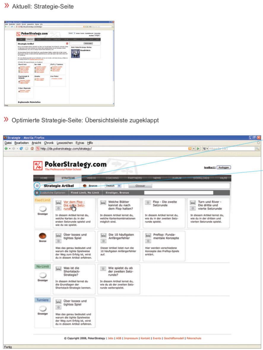
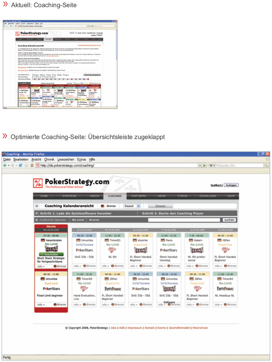
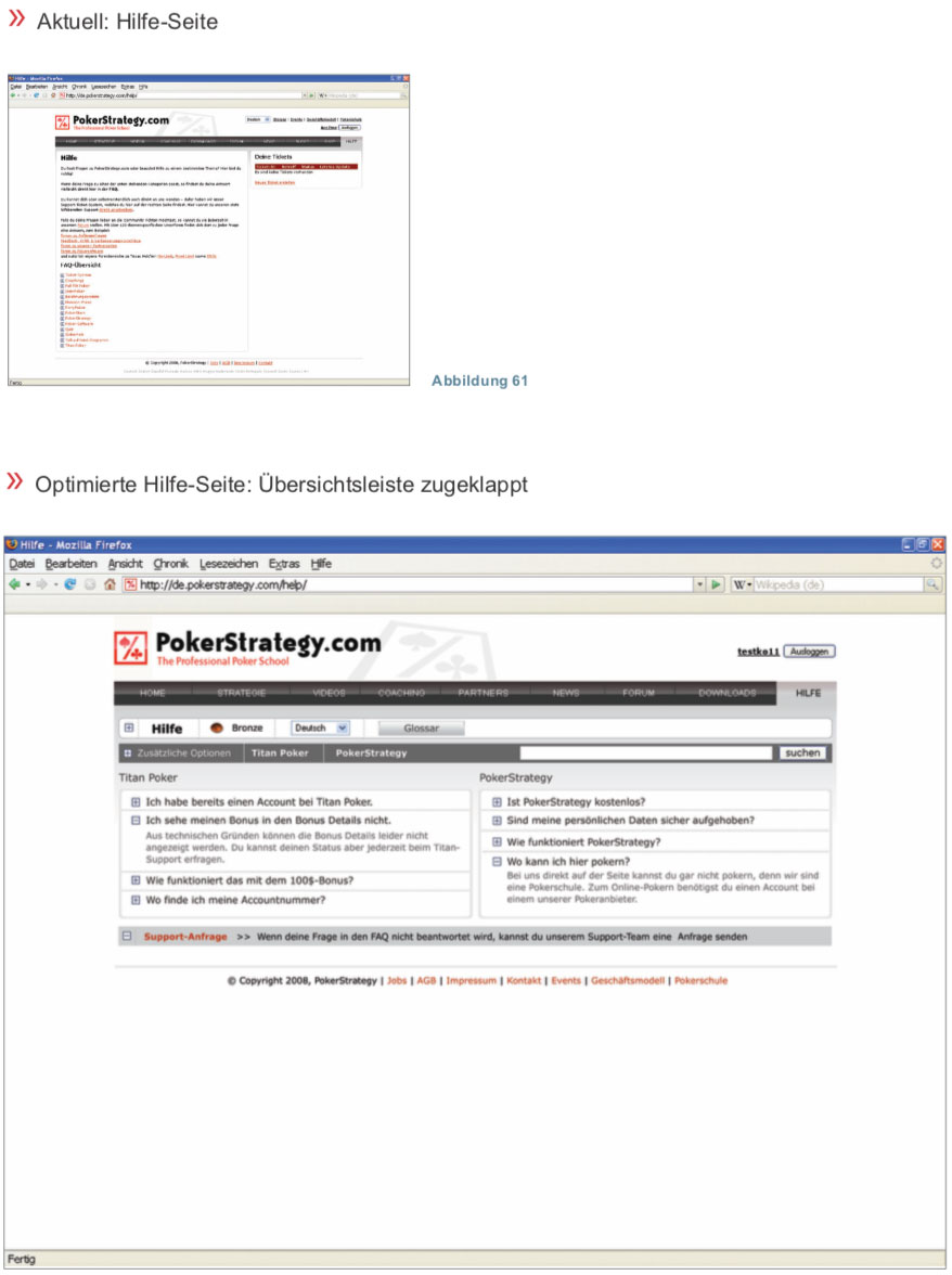
Pokerstrategy.com was in 2009 already available in 14 languages and had over 750,000 members. The website was filled with a lot of information and new content was uploaded daily. The website looked too cluttered and so it happened more and more often that users could not navigate well on the website. For example, on the home page, the structure was missing, so that one could not see the navigation area and service area at first glance.
Design Principles
-
Retaining the website identity
- The website identity is the brand identity on the internet.
- A Change in web design must not lead to a change of the brand.
- The structure should be cleaned up, but existing users should not be confused after the optimization. Instead, they should achieve their goals even faster.
- Self-evident navigation
- Create website trustworthiness through the design
Client
ICANS GmbH
Project link
Category
- User Experience
- User Interface
- Scrum
- Interview
- Usability Test
- Prototyping
- B2B
Planning
With the help of ‘Scrum’, I established an iterative development process.
Description of the development process- Brainstorm
- Refine the product backlog
- Scheduling and repeating the process
Usability Tests
Before the start of the website optimization and after every two sprints, a usability test was conducted, validating design changes and generating insight for further design changes.
1. First usability test with the original website- 8 people were examined, 5 of whom knew the site well and 3 people did not know the site at all.
- a) Procedure of the test
- » A short explanation about the test procedure
- » Task: e.g. find your bonus points.
- » Video recording of test persons
- b) Insights through observation of interaction
- » Home Page: The different areas on the home page should be clearly recognizable and the personal information should be in the foreground.
- » Other main pages: Individual solutions for the visibility of different learning materials
- » and more:
- Filter options
- Focused information presentation
- Avoid everlasting scrolling
- Use of a uniform color scheme

2. Verification of the prototype
- The prototype was printed on papers for the test. There were 6 subjects who were regular internet users. Three of them already knew the website and the other three did not.
- a) Procedure of the test
- » A short explanation about the test procedure
- » Task: e.g. find your bonus points.
- » Sound record of test persons statements
- » Completing a general questionnaire by the test subjects to rate the website
- b) Insights through observation of interaction
- There were no major changes, but many small details that improve visibility and usability.
- Here are some examples:
- Regrouping of elements
- Uniform menu design
- Access to the glossary
- Information content of certain menu items
- Filter functions
- Sorting the filter options
- Feedback
- History
- Favorites
- Community
The Result